Marsala is the Color of the Year for 2015. Why all the hate?
Pantone, the global color authority, announced PANTONE® 18-1438 Marsala, a naturally robust and earthy wine red, as the Color of the Year for 2015.
“While PANTONE 18-3224 Radiant Orchid, the captivating 2014 color of the year, encouraged creativity and innovation, Marsala enriches our mind, body and soul, exuding confidence and stability,” said Leatrice Eiseman, executive director of the Pantone Color Institute®.
From the reaction I saw in my Facebook newsfeed to commentary on various posts, you would think the color world is going to crash around us leaving wine stained marks on our rugs and upholstery. Seriously? Why all the hate?
Every year I share the color of the year in my “Claudia’s Corner” column in the Times Herald Record. And every year I share this advice, ignore the trends, especially if you don’t like them. But if you do like the color trend, stock up while it is available.
No one says you MUST use a color. No one says you MUST follow a trend. Classics neutrals are always in. Shades of Gray continue to be popular. But guess what, not everyone likes gray, which is a neutral. And not everyone wants to live in a tone on tone creamy blend of whites and grays. Some find that look very cold. After awhile it all start looking the same. Pops of color are a way of adding a bit of flair and personality to a space, whether it is on the walls or in decorative accessories.
One of the best comments I read on a blog regarding Marsala:
“I am so over all the GREY everywhere. Yes, it’s mod, clean, and STERILE. Every white subway tile with grey marble counter room I see makes me feel like I am about to enter the morgue and be embalmed! Bring on Marsala! “
There was even a comparison of Marsala to the color Mauve. Mauve? Really? I lived through the 80’s and remember mauve. This color is definitely not mauve.
Dramatic and at the same time grounding, the rich and full-bodied red-brown Marsala brings color warmth into home interiors. Whether in a flat or textured material, or with a matte or gloss finish, this highly varietal shade combines dramatically with neutrals, including warmer taupes and grays. Because of its burnished undertones, sultry Marsala is highly compatible with amber, umber and golden yellows, greens in both turquoise and teal, and blues in the more vibrant range.
Marsala for Interiors
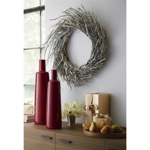
Complex and full-bodied without overpowering, Marsala provides a unifying element for interior spaces. Add elegance to any room by incorporating this rich and welcoming hue in accent pieces, accessories and paint. Marsala’s plush characteristics are enhanced when the color is applied to textured surfaces, making it an ideal choice for rugs and upholstered living room furniture.
Nurturing and fulfilling, Marsala is a natural fit for the kitchen and dining room – making it ideal for tabletop, small appliances and linens throughout the home. The hue will be especially prominent in striping and floral patterns found in printed placemats, dinnerware, bedding and throws.
Let’s look at the past decades and their colors of the year…
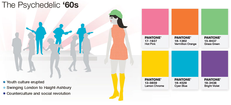
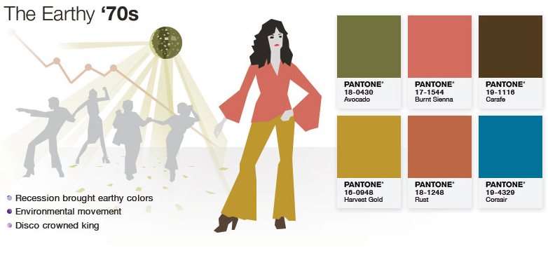
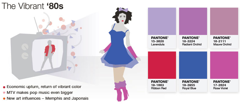
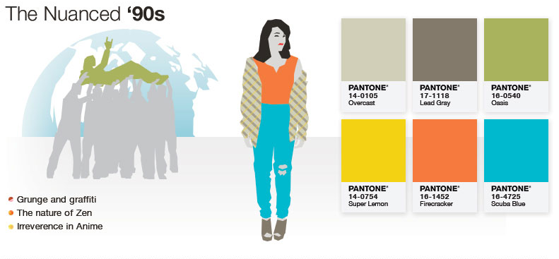
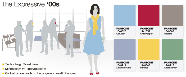
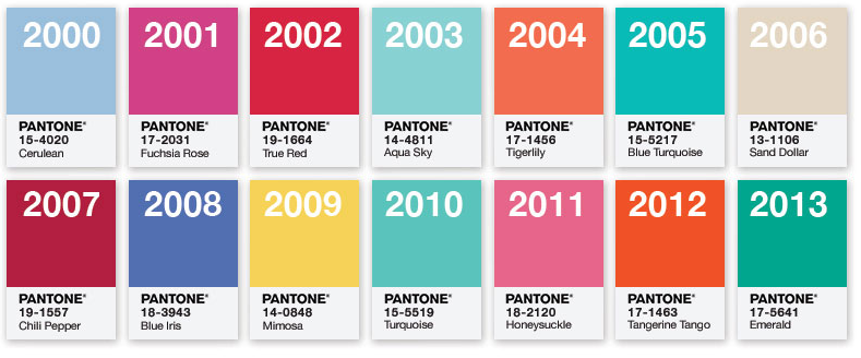
If we can survive Honeysuckle (a Barbie like pink) and danced our way through the year of Tangerine Tango, this Marsala color is a refreshingly warm and cozy change. It is probably the most realistic color in the above list. I know I will not only be eating it (I make a mean chicken marsala) but wearing it as well (I don’t mean by spilling food on me!). This color is sure to make its way into my closet and home. Let’s all take a deep breath and get over it.

