The 2018 colors of the year
Happy New Year! Here are the 2018 Colors of the Year. Get ready for pops of color.
Pantone: Ultra Violet
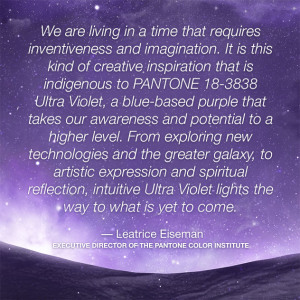
A dramatically provocative and thoughtful purple shade, PANTONE 18-3838 Ultra Violet communicates originality, ingenuity, and visionary thinking that point us toward the future.
Enigmatic purples have also long been symbolic of counterculture, unconventionality, and artistic brilliance. Musical icons Prince, David Bowie, and Jimi Hendrix brought shades of Ultra Violet to the forefront of western pop culture as personal expressions of individuality. Nuanced and full of emotion, Ultra Violet symbolizes experimentation and non-conformity, spurring individuals to imagine their unique mark on the world, and push boundaries through creative outlets.
Historically, there has been a mystical or spiritual quality attached to Ultra Violet. The color is often associated with mindfulness practices, which offer a higher ground to those seeking refuge from today’s over-stimulated world.
Benjamin Moore: Caliente
“Strong, radiant and full of energy, Caliente AF-290 is total confidence. It is pleasing, passionate and makes people feel special, like ‘red carpet treatment’,” Ellen O’Neill, the company’s director of strategic design intelligence, said in a statement.
Sherwin-Williams: Oceanside
Oceanside SW 6496 is a rich blue with jewel-toned green, a complex, deep color that offers a sense of the familiar with a hint of the unknown. It is universal when it comes to design style from mid-century modern to Mediterranean-inspired, traditional to contemporary.
Behr: In The Moment
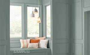
In The Moment is a cool, tranquil, spruce blue inspired by nature and is soothing, restorative coalescence of blue, gray and green. This comfortable color evokes a sense of sanctuary and relaxation amid our busy, always-on lives. In name and color, this hue speaks to our desire to take a break, be present and recharge. In the Moment is versatile and perfect to use for both interior and exterior projects. It also crosses styles, ideal for working with traditional, modern, coastal and global décor.
Color is personal
What does this mean in the grand color scheme? Nothing really. These are all predicted color trends. You’ll be seeing more purples in fashion and home accessories. If that is your favorite color, stock up!
As far as paint colors go, as a professional stager, I tend to play it safe and stick with livable, saleable colors. After all, how often do you paint your house? Light grays are still popular. Thanks to the modern farmhouse trend, chalky white is also very popular.
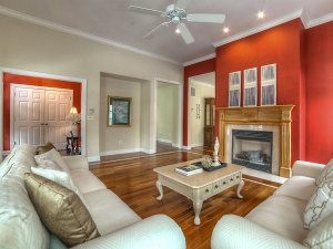
PHOTO CREDIT: STEVE BELNER OF PHOTOSVISIONS
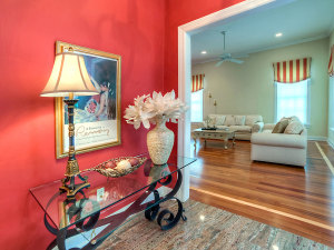
PHOTO CREDIT: STEVE BELNER OF PHOTOSVISIONS
You don’t have to live in a sterile, benign house. It is all about balancing the space using color, furniture and accessories to enhance your living space to suit your lifestyle. Accessorize your space with color but consider keeping the bold tones off your walls. Dark colors add mystery and drama. Light colors create spaciousness.
My choice: The color of my office is very similar to Behr’s ‘In the moment’. Ultra violet is a color I would wear but not live with. Oceanside is beautiful. Caliente is too dramatic for me but a pop of red is fun. Each would make great front door colors.
