Officially retired!
Claudia is no longer staging as she is officially retired. Yay! Thank you for being part of my staging journey or reading my former Claudia’s Corner column. My blog has all of my columns. Happy trails!
Claudia is no longer staging as she is officially retired. Yay! Thank you for being part of my staging journey or reading my former Claudia’s Corner column. My blog has all of my columns. Happy trails!

September has always been the beginning of a New Year for me. January pressure for resolutions at a seasonally depressing time of year is something I never connected with. But September, ah sweet September, a time of new beginnings, cooler temperatures, and my birth month.
Read more
For Valentine’s Day or any day of the year, it is nice to do something special for your loved one, whether it is a significant other, family member or yourself. Whether you are in a relationship or not, romance can be an everyday occurrence when you romance your home.
Read more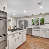
January 2020, the calm before the pandemic storm, I met with Regina and Scott Eisenbacher for a Pre-Listing Staging Consultation. Regina mentioned how they could not agree on all the projects and needed expert advice to guide them in the right direction.
Read more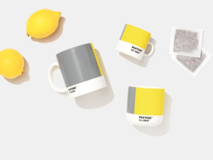

One color just wasn’t enough for 2021. Pantone selected 2 hues: a neutral gray and a vibrant yellow.
PANTONE 17-5104 Ultimate Gray + PANTONE 13-0647 Illuminating, two independent colors that highlight how different elements come together to support one another, best express the mood for 2021. Practical and rock solid but at the same time warming and optimistic, the union is one of strength and positivity. It is a story of color that encapsulates deeper feelings of thoughtfulness with the promise of something sunny and friendly.
A message of happiness supported by fortitude, the combination of these 2 colors is aspirational and gives us hope. We need to feel that everything is going to get brighter. Hope is essential to the human spirit. It highlights our innate need to be seen, to be visible, to be recognized, to have our voices heard. A combination of color whose ties to insight, innovation and intuition, and respect for wisdom, experience, and intelligence inspires regeneration, pressing us forward toward new ways of thinking and concepts.
For over 20 years, Pantone’s Color of the Year has influenced product development and purchasing decisions in multiple industries, including fashion, home furnishings, and industrial design, as well as product packaging and graphic design.

Take a moment to reflect and reset. An intriguing blue green that is balanced, and deeply soothing, the Benjamin Moore Color of the Year 2021, Aegean Teal 2136-40, creates natural harmony. The blue-green hue with gentle gray undertones strikes a balance between being both inviting and soothing, two qualities we are increasingly yearning for as we spend more and more time within our homes.
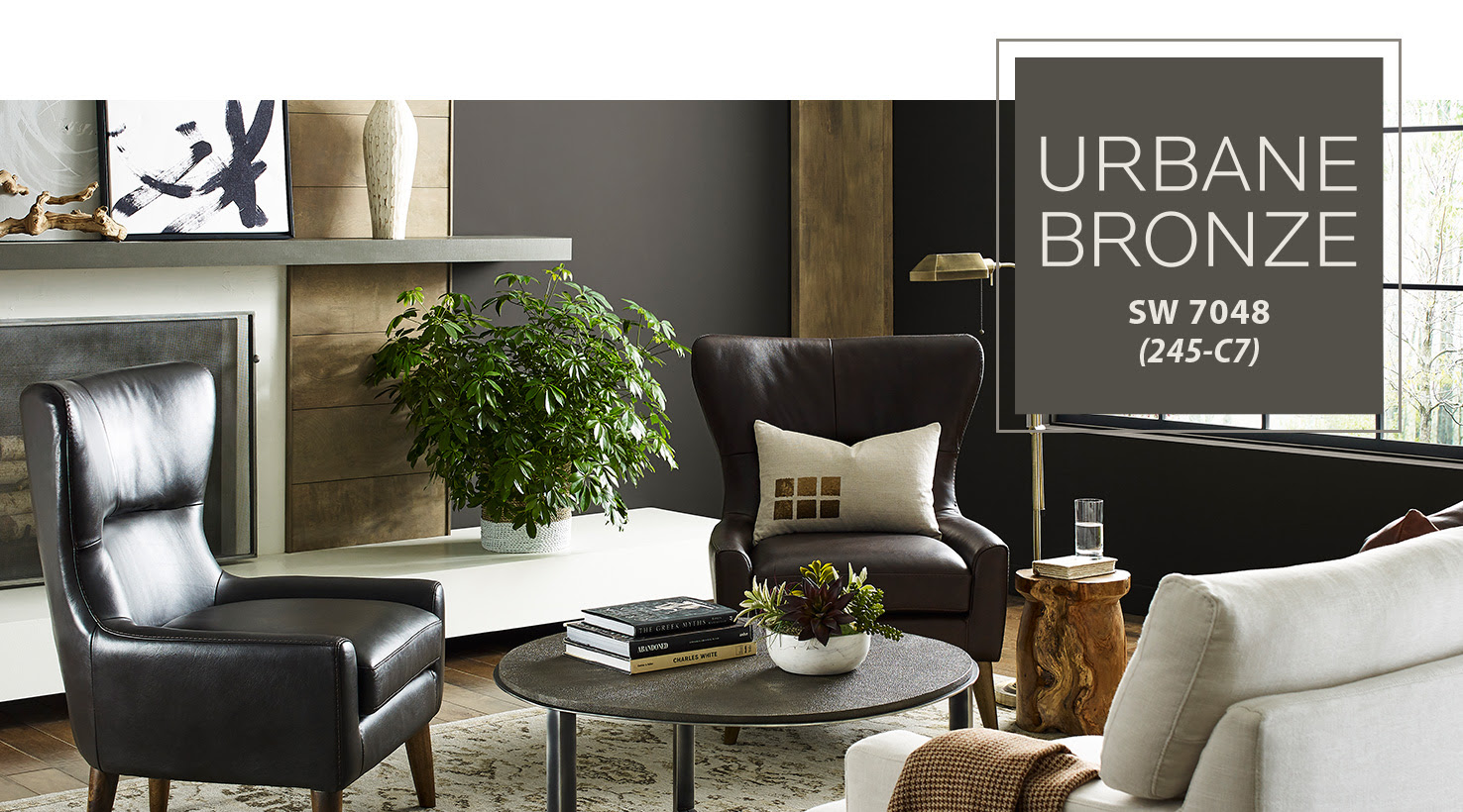
Urban Bronze captures that simple sophistication every space is searching for. It is a color rooted in nature, but it also has a unique ability to ground a room through organic appeal. This warm hue draws from nature for a feeling of relaxation and serenity.
Now more than ever, our homes have become the backdrop to our lives, reminding us that the moments worth cherishing have always been right in front of us. As we’re looking to create the ultimate retreat for reflection and renewal, we’re turning to a hue whose natural simplicity and nature-inspired energy cultivate a sense of calm from the ground up.
Colors of the years set trends for the coming year. If you love any of the colors, go for it. If not, ignore them. Trends come and go.
Grays have been popular for years and will continue to be the go-to neutral color. Don’t like gray? Don’t buy into it. Yellow can be a nice pop for an accent color. As I scan my house, hardly any yellow appears except for light tones in a few pieces of art. When I was staging vacant homes, yellow would be used in accessories on occasion. My preference would be to keep it off the walls. You may see this gray-yellow combo appear in fashion and home accessories.
Blue green colors are my color preference. I’ve been living with them for years throughout my 2 homes (my former & newer house of 2 years).
Dark Bronze is definitely a dramatic color that I like although I don’t see myself switching things up in my house. It may be appropriate for a client’s home if they were looking for a dark color.
Color preferences are personal. You may read this and have a yellow room that you adore. That’s is great! When it comes to colors, live with what you love and makes you happy.

The only thing that is constant is change and 2020 has been challenging. After running for 14 years, this is my final Claudia’s Corner column. What an amazing ride!
Try supporting small local businesses, artists, makers and friends with service-based businesses. Yours truly is being gifted by a husband as a surprise for his wife who has been wanting a consult with me. You may choose to shop online but even that can be with local businesses. Here are a few favorites.
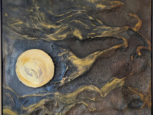
Over the years, I have acquired quite a few pieces of art by local artists. Finding that special piece that speaks to you is quite easy. You will find you don’t have to look too hard or go too far. Visit a local gallery, art school, studio tour, artisan fair or search online. Viewings may now be by appointment or virtual. When art connects to your heart, you know you found that special piece to bring home. Read more
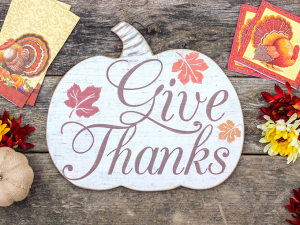
The holidays are quickly approaching. Family gatherings may change significantly due to the pandemic. If your children will be home for the holidays, whether they are visiting or living with you, no matter what their age, it is a great time to access the mess. Read more
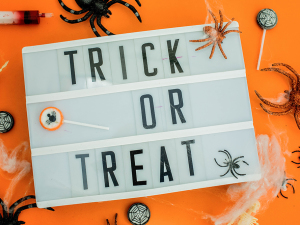
Boo! Did I scare you? Maybe not but you may be tense, stressed and overwhelmed for reasons like the pandemic, election and change in the weather. Add our own personal ‘stuff’ and it is the making of a bone chilling spooky movie. Here are some Halloween tricks and treats. Read more